Tuesday, 7 October 2014

PLANNING: IDENT

iSTOPMOTION

Today I explored new software, iStopMotion, using a webcam to take shots then editing using 'onion skinning'. The project was to make a production company ident for our imaginary company "S & T Productions".
When creating the ident, we were aware throughout that upbeat music would be needed in order to create more atmosphere and would help to underpin with the bright colours used throughout. 


Monday, 6 October 2014

WHAT WE DID ON OUR HOLIDAY

What we did on our holiday

The genre of the film is comedy (IMDB)  
The film what we did on our holiday is a family film (BBC film )

The film is spreading the world by using BBC social media for example twitter.

The films trailer was also advertised on the Metro website. The Metro website also stated that the film was written by the same makers of the TV series outnumbered. This website also  has the facebook and twitter logos encouraging people to share the page on social media this way the film gets lots of advertisement.  The radio times website also use the social media technic to advertisement the film.

After using this film as a case study it inspired me to go to the Every Man cinema in Walton to see it. I really enjoyed it although the story line is a sad one it was presented in a light way that was easy to watch. 


Sunday, 5 October 2014

RESEARCH: ART OF THE TITLE


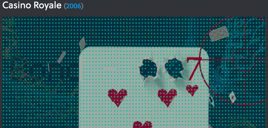
Continuing my research, after looking at the Walking Dead title sequence I wanted to explore a different genre and so I chose the Bond film Casino Royale. 


  • The first scene of the title sequence classically starts with Bond aiming and shooting directly at the camera and the blood begins to drip down the screen this automatically gains the audiences attention and it established the films genre (action) all with in the first five seconds.
  •  Though out the title sequence there is a constant theme of casinos and cards showing that there will be gambling involved in the film,  but the audience don't know weather he will be gambling for his life... 
  • Cleverly in the sequence as the silhouette    of Bond fights off and kills the enemy as they fall they shatter into hearts or diamonds ( continuing the cards theme) this is effective and keeps the opening of the film reasonably light hearted to start with before any guts and gore actually take place.  
  • The shots used in the sequence are mainly panning and tracking due to the genre being action. It presents the film in a active, lively way. 
  • Another clever idea that is presented clearly is that all of the enemies are a red silhouette    where as bond is the only one in a suit and is a black solute making it clear to the audience that he is the main character.  Furthermore, the font is kept consistant as a bold white print that stood out well as the main colour theme was red and black creating a casino like feel.
  •  The background/ miss-en-scene  was extremely effective and it established that is was a spy film with a casino theme as they used the target symbol that then changed into a casino wheel. 
  • The music is an upbeat song that fits well with the genre of the film as it has a strong beat that makes it current but also fitting with the action theme by one of the lines from the song being 'arm yourself as no one will save you'.
  • Finally the way that the directors used the cards to introduce the main character as the 007 agent is extremely effective again showing the audience that there is link between the two and the way this is pulled off is by there being 2 gun shots into the card the 7 of hearts as then the gun shots act as the 0's before the 7. It also creates a sense of irony as it is a red 7 of hearts this represents blood and death is a main theme in this film. 


.

REPRESENTATION


  1. Roland Barthes Mythologies (1964): state what you learned about his approach and how you 'read' this image. 
This is a quote from Roland Barthes explaining his views on the image:"I am at the barber's, and a copy of Paris-Match is offered to me. On the cover, a young Negro in a French uniform is saluting, with his eyes uplifted, probably fixed on a fold of the tricolour. All this is the meaning of the picture. But, whether naively or not, I see very well what it signifies to me: that France is a great Empire, that all her sons, without any colour discrimination, faithfully serve under her flag, and that there is no better answer to the detractors of an alleged colonialism than the zeal shown by this Negro in serving his so-called oppressors. I am therefore again faced with a greater semiological system: there is a signifier, itself already formed with a previous system (a black soldier is giving the French salute); there is a signified (it is here a purposeful mixture of Frenchness and militariness); finally, there is a presence of the signified through the signifier... In myth (and this is the chief peculiarity of the latter), the signifier is already formed by the signs of the language... Myth has in fact a double function: it points out and it notifies, it makes us understand something and it imposes it on us..." (Barthes 1964)Personally

 I agree with Barthes that, the meaning of the picture is everything that you can physically see with your eyes, but that you can also see more if you look deeper into the message of the image. Again agreeing with Barthes that its showing that France is an Empire that does not there is no colour discrimination as anyone can salute the French flag. From this exercise I have learnt that it is important to look at an images meaning in the media, what you can physically see and why they have wanted you to see it in this way. Then you also have to be aware that there can be a message behind the things you can physically see and how the publisher would want his image to be interpreted. 


2. This Panzani avdertisment is an example of a denotation, it persuades the viewers that the product if fresh and almost home cooked produce although it is just a dry and tinned products. Some ways that is effect is carried out is by firstly placing the products in a while string bag making it look as if the food has been purchased from a local market. Furthermore, at the bottom of the string bag there is a selection of fresh looking produce including tomatoes, mushrooms and potatoes this helps the publisher convince the viewers that the product is as fresh as vegetables brought from a fresh market stool. Plus the way that the product is flowing out from the bag makes it seem as tho they have brought so much of it that it does not fit in one bag making it seem popular and that other people will enjoy the product. Finally the method of using the Italian colours for the logo of the brand makes the product again look more wholesome, natural, homemade and fresh. 


This is a still from Silver Linings Playbook.  This image,shows that the two dancers in white are ammeter in comparison to the others. We know this by firstly what the man is wearing ( ordinary suit trousers and a white shirt) where as the other male dancers in the background are wearing flared dance trousers and sparkly black silk shirts. Furthermore another way that the two dancers in the middle look out of place and ammeter is the way they are reacting to their scores, their arms are lifted and they are shouting with joy. Due to the reactions of the people around them and the location this is not the way you react and behave at a formal event. Likewise one of the more professional looking dancers has his man on the mans shoulder as a sign of comfort as their scores from the judges are low where as the dancers show the opposite and are extremely happy and excited by their score showing they are not at the standard of the other dancers.  

Friday, 3 October 2014

RESEARCH: ART OF THE TITLE


Today we investigated the Art of the title website as research to help us have a better unstinting of what genre we would like to create for our film opening.


  • Set in a eerie abandoned town the title sequence of The Walking Dead (season 3) creates a intense uncertain atmosphere.  The sepia tones create a dark mise-en-scene that fits with the horror genre.
  •  The use of time lapse allows the viewer to feel on edge as time is passing so fast plus the music is fast paced which makes the viewer feel as though it is building up to an event.
  • The horror quality is clearly presented through the miss-en-scene: abandoned cars and deserted graveyards combined with the lack of colour create the ghostly atmosphere underpinning the fact that no humans are shown in the title sequence. Only the eyes of a creature appears, eyes that are so bloodshot it is thought to be supernatural implying that all the deserted  locations in the town had been taken over by this species.
  • The camera movement in the sequence is mainly tracking or a close up with a blurred background. The tracking shot fits with the fast moving theme and that it creates panic and terror.  Additionally the colour and lighting are dull and grey putting emphasis on the fact that the town is lifeless and abandoned.

I feel that watching this and analysing has been extremely useful as I am now considering creating a thriller/horror themed film opening.

PRELIMINARY EXERCISE


We devise, film and edit a short exercise in film making which OCR asks us to complete prior to our film opening. We watch examples of the exercise such as those undertaken by Claremont students last year and others like this one.
Here is another example. Here is another.
Here is the OCR Specification 
We are doing the video brief which includes the preliminary exercise as set out below


This was the first experience I had of working with my group (Eliza, Tammy, Harvey and I). We set out with lots of enthusiasm and many valid ideas.  As a group we felt we bounced off each others ideas and ended up filming a comedy prelim. We then went back to the Macs in the class room and uploaded our footage onto iMovie. During the editing process we realised that we were cropping lots of unnecessary footage and many scenes were out of focus, so we desied as a group to refill them. After editing half of the footage we had already filmed we also realised that it was too long as the maximum was 2 minuets and that we hadn't included all of the necessary requirements. So we learn from this and went out and refilled a similar and more to the point prelim that included all the correct camera shots. 


Thursday, 2 October 2014